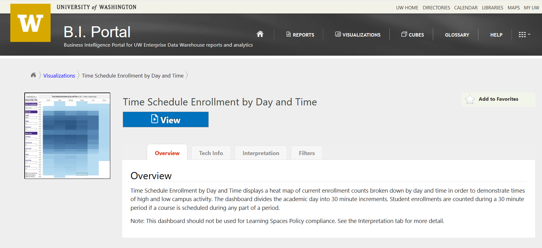
RPG Release: Time Schedule Enrollment by Day and Time Visualization in BI Portal
The Report Prioritization Group released a new visualization to the BI Portal: Time Schedule Enrollment by Day and Time.
This tool enables planning by displaying a heat map of current enrollment counts broken down by day and time in order to demonstrate times of high and low campus activity. The analysis tool divides the academic day into 30 minute increments. Student enrollments are counted during a 30 minute period if a course is scheduled during any part of a period.
How to Use this Visualization:
There are two primary ways to use this analysis tool:
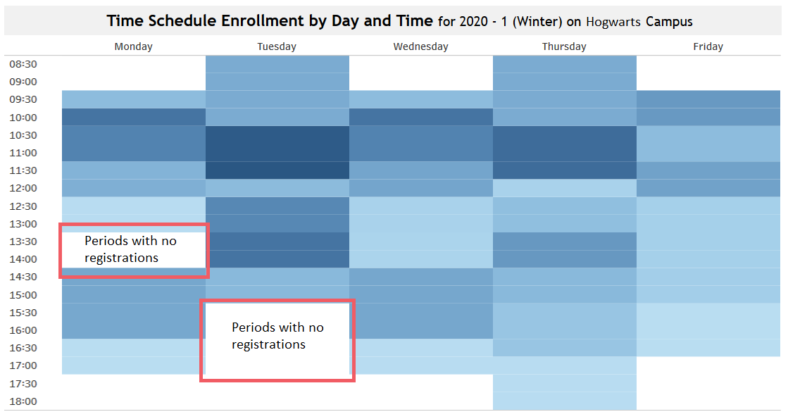
Planning an Event:
A program coordinator who wants to schedule a speaker or event may have the question, “what are the time periods in between classes when students are on campus and would be more likely to attend a speaker session?”
If you filter down to a specific department, you can view all courses managed by a department. Look for the blank periods between courses:
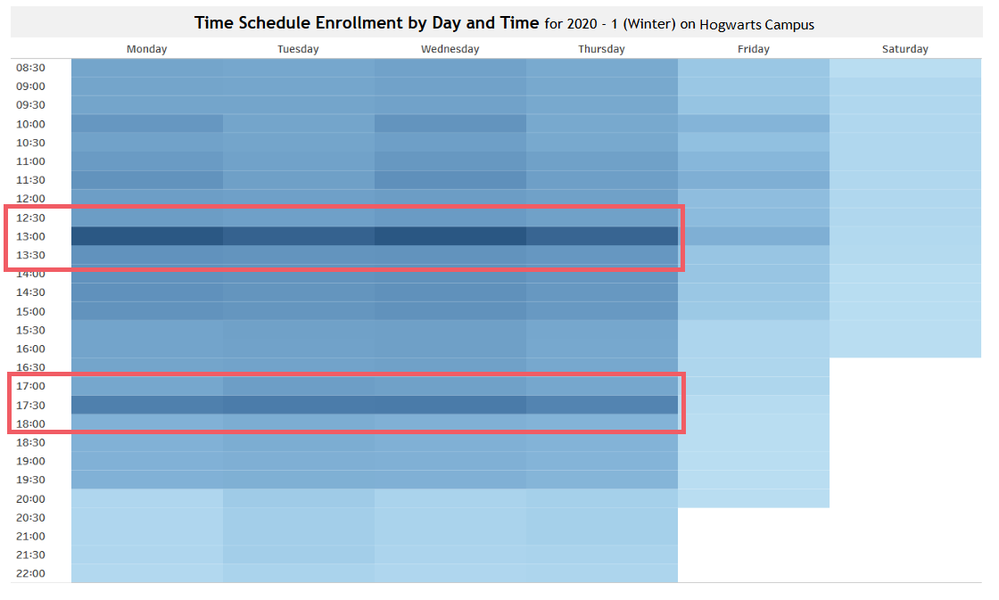
Capacity Planning:
A planner in Student Services may want to answer the question, “When are students likely to be on campus, so I can staff my office to help students during peak times of activity?”
If you filter at the campus level, you can view the overall enrollment counts for a whole campus to view peak periods of activity:
Important Details:
Please note: This analysis tool should not be used for Learning Spaces Policy compliance. For Learning Spaces Policy work, please use the Learning Spaces Policy report in the BI Portal.
The heat map displays “current enrollment” counts as a table. The X axis displays the academic week, Monday through Saturday. The Y axis displays the academic day broken down into 30 minute increments. The Y axis time range represents the minimum and maximum times for the population of courses in the table. A heat map demonstrates periods of high and low campus activity.
The population of courses excludes those with the following attributes:
- All Withdrawn courses
- Courses with invalid days
- Courses with 0 enrollment
- Courses with SLNs equal to 0
- Courses with invalid start or end times (e.g. 00:00, 25:00)
How are the counts calculated? Student enrollments are counted during a 30 minute period if a course is scheduled during any part of a period. For example, if a course is scheduled from 8:30 – 10:20, a single student will get counted in each of the time periods from 8:30 to 10:00, but will not be counted in the 10:30 time period. This means that student enrollments are intentionally duplicated many times throughout the visualization. This is intentional because the goal of the tool is to demonstrate when students are registered and are assumed to be “on campus” for a given time period.
Are these “current enrollment counts” or “census day counts”? The counts and times are based on current enrollment counts in the Time Schedule data that are updated daily. The data are not snapshots of census day counts. This means that if a student drops a course or registers for a course, these changes will be reflected in the visualization. The data are sourced from the EDW, are updated daily, but always reflect the previous day’s changes to Time Schedule. This analysis tool does not display real-time Time Schedule or registration changes.
Questions?
This visualization references important institutional concepts like “Section Type“, “Learning Type” and many others. If you have questions about the meaning of this or any other term, please explore the links or find more detail in the Knowledge Navigator.
As always, if you have any questions, please write help@uw.edu and put “BI Portal Visualization Question: Time Schedule Enrollment by Day and Time” in the subject line.